Overview
Designed and built the interface for the ONE Data Agent, an AI-powered tool that gives journalists, policymakers, and researchers plain-language access to tens of millions of global health financing data points — powered by Google Data Commons. Work covered the full interaction layer: chat interface architecture, animations, navigability, and readability — with a deliberate focus on making AI feel human without sacrificing rigor.
Collaborated closely with the research and data team to ensure interface decisions reflected how analysts actually think about health financing — translating domain expertise into interaction patterns that made complex queries feel approachable. Worked in tight loop with backend and engineering on data delivery, response formatting, and the constraints that shaped what the interface could credibly promise. A core design challenge was transparency: the tool's value rests entirely on source accuracy and the absence of hallucination, so every decision across design and engineering had to reinforce trust and legibility of where data comes from.
- Website: data.one.org/tools/agents/health-financing
- Client: One.org
- Team: Next Solutions, One Data
- Role: Product Design, UI, UX and Interaction Design, Frontend Engineer
- Tools: Figma, Trello, Github, ReactJS, TypeScript, CSS
- Year: 2025
Context
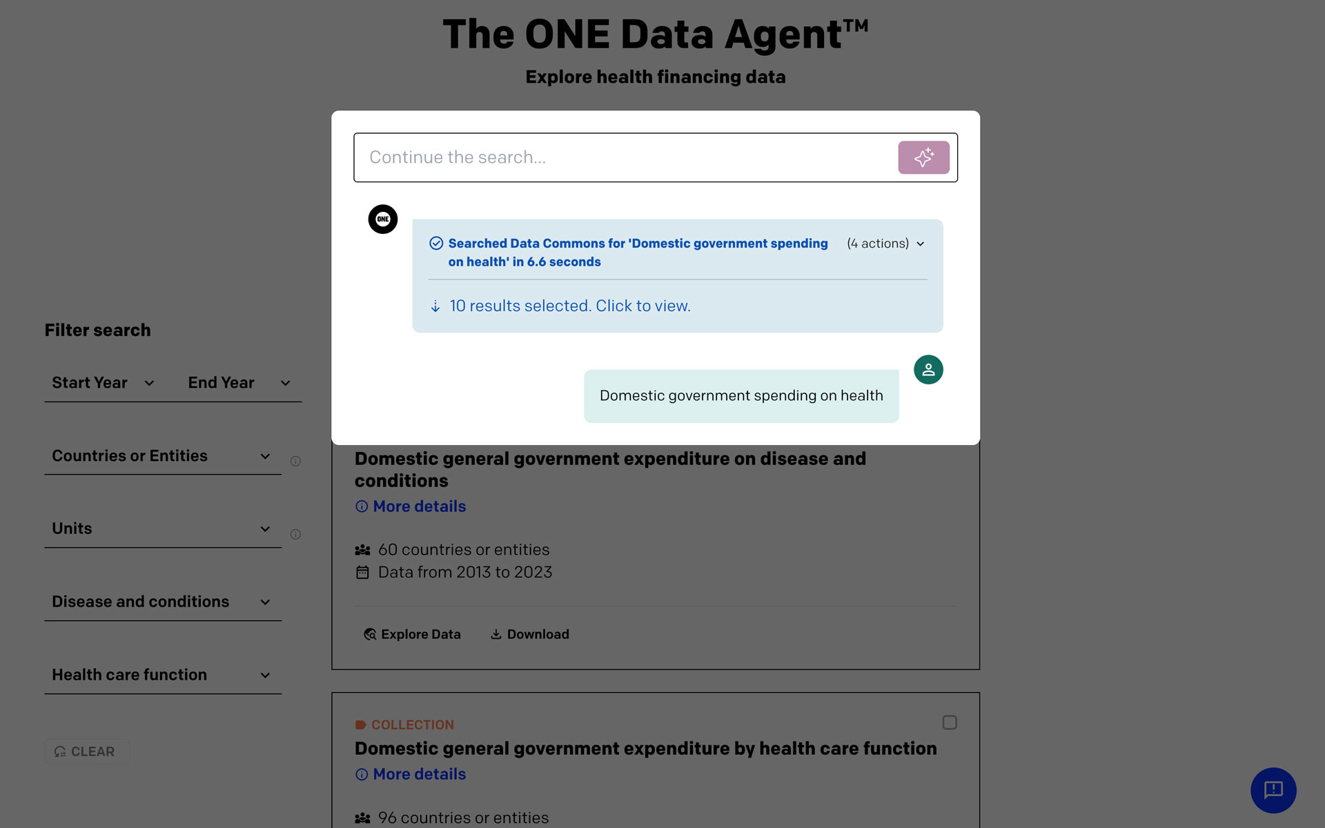
The ONE Campaign needed a public-facing tool that made its global health financing data — tens of millions of data points drawn from Google Data Commons — accessible to non-specialist audiences: journalists, policymakers, and researchers who don't speak SQL or know where to look.
Problem
Open data is only open in theory if the interface requires technical fluency to use. The challenge wasn't access to data — it was legibility, trust, and the specific anxiety users feel when an AI tool gives them a number they can't verify.
Role & Collaboration
Owned product design, UI, interaction design, and frontend engineering. Embedded across three teams: research and data (domain logic and query accuracy), backend and engineering (data delivery, response formatting, API constraints), and the ONE Data team (editorial and policy priorities).
Process
Interface decisions were shaped directly by how the research team thinks about health financing — not by generic chat UI conventions. Interaction patterns were stress-tested against real analyst queries to ensure the interface didn't over-promise what the data could support. Close engineering collaboration meant design constraints were real, not aspirational.
AI Chat Interface
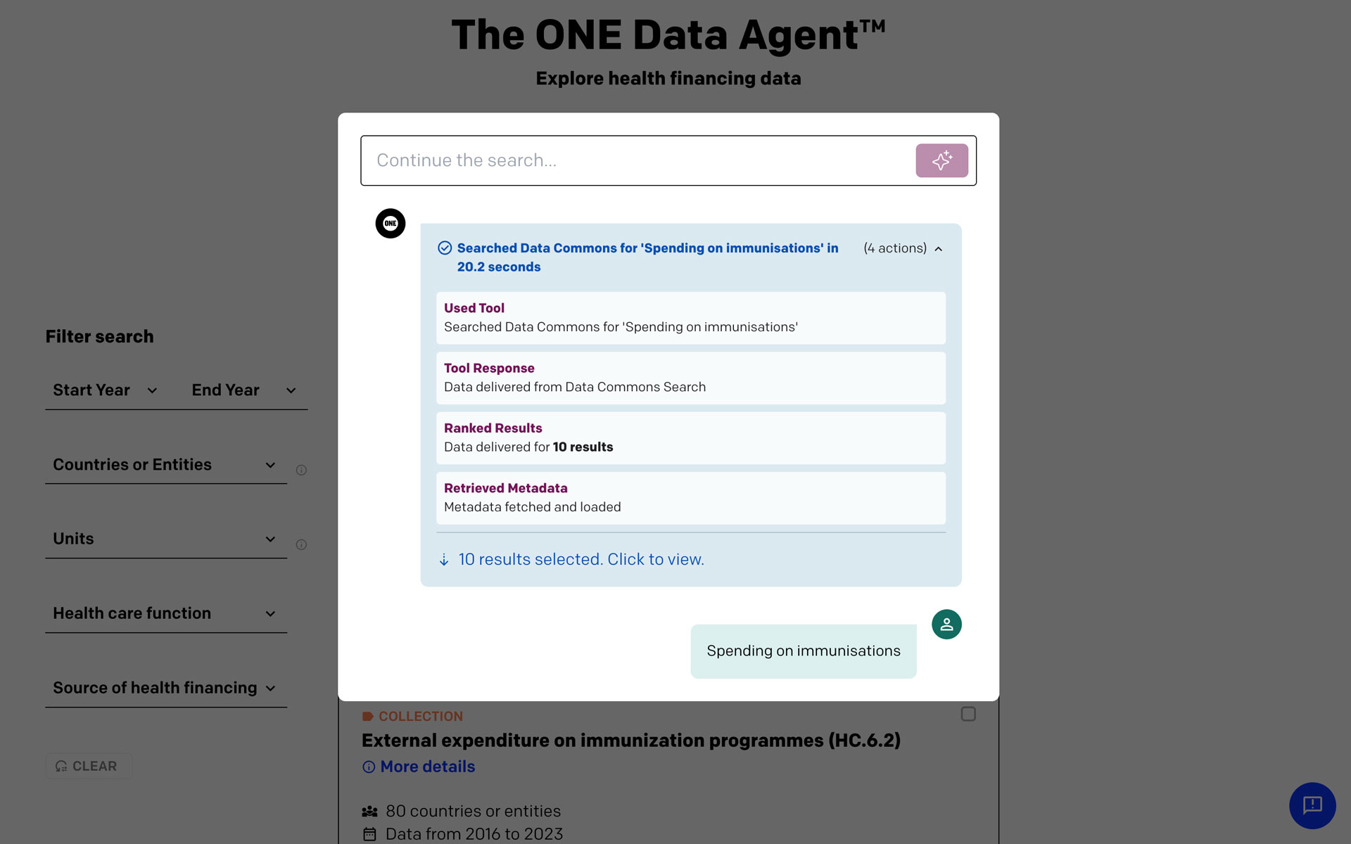
The chat interface was designed around a single constraint: every answer had to be verifiable without making verification feel like homework. In a tool where trust is the product, source attribution couldn't be a footnote — but it also couldn't fragment the reading experience into a wall of citations.
The solution was a layered disclosure model: responses surface clean, plain-language answers first, with sources available inline but visually subordinate — accessible on demand rather than forced on every read. Responses streamed progressively, with structured data, tables, and prose coexisting in a single answer without competing for attention. Loading states and latency were treated as interaction design problems — animation and progressive rendering maintained forward momentum during queries, keeping the interface feeling alive rather than stalled.
Data Visualization & Graph Layer
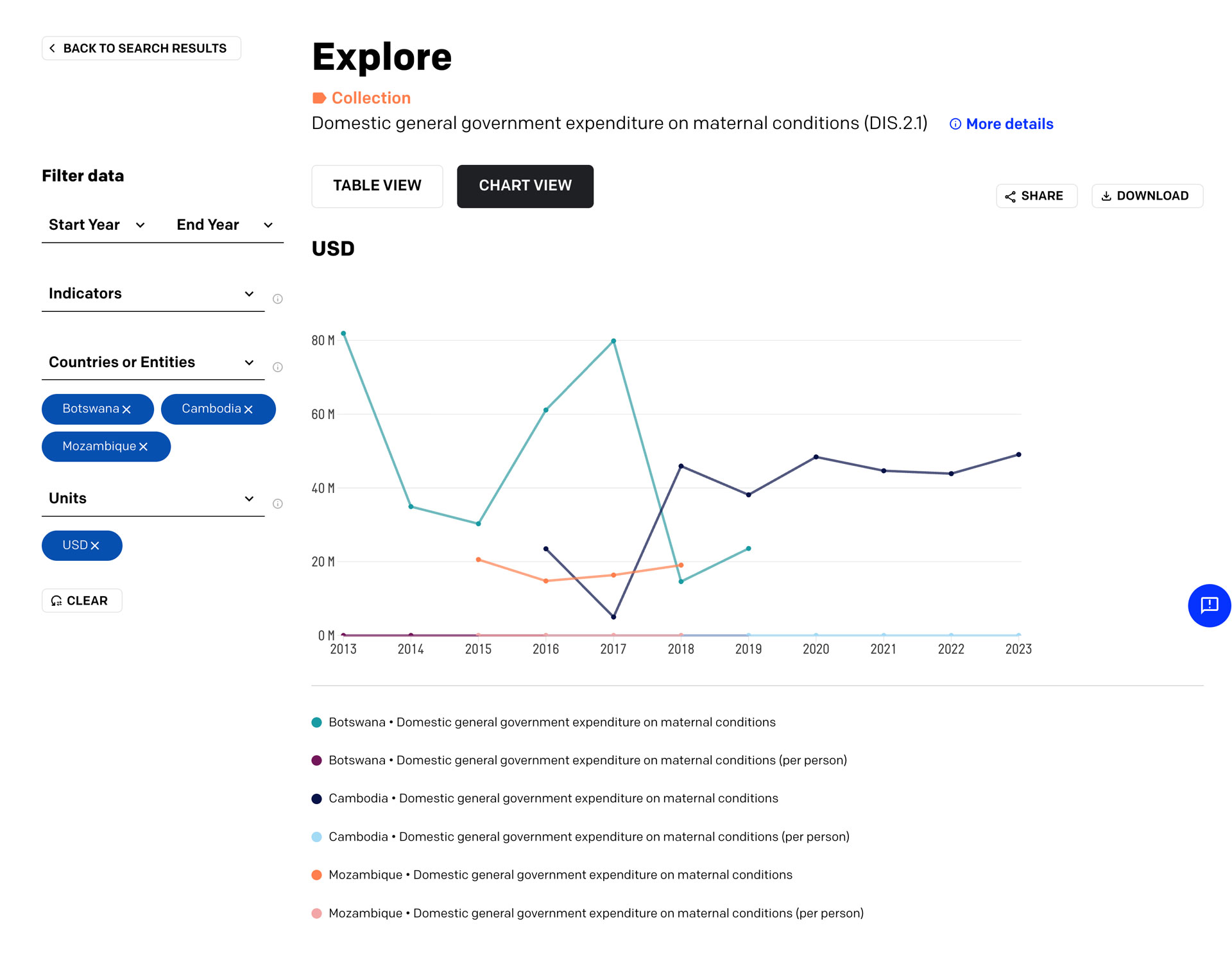
The core design challenge for charts was making visualizations feel native rather than embedded from elsewhere — animation, labeling, and source attribution were treated as deliberate interface moments, not decoration. Responses could contain structured tables alongside prose, keeping data scannable without fragmenting the reading experience.
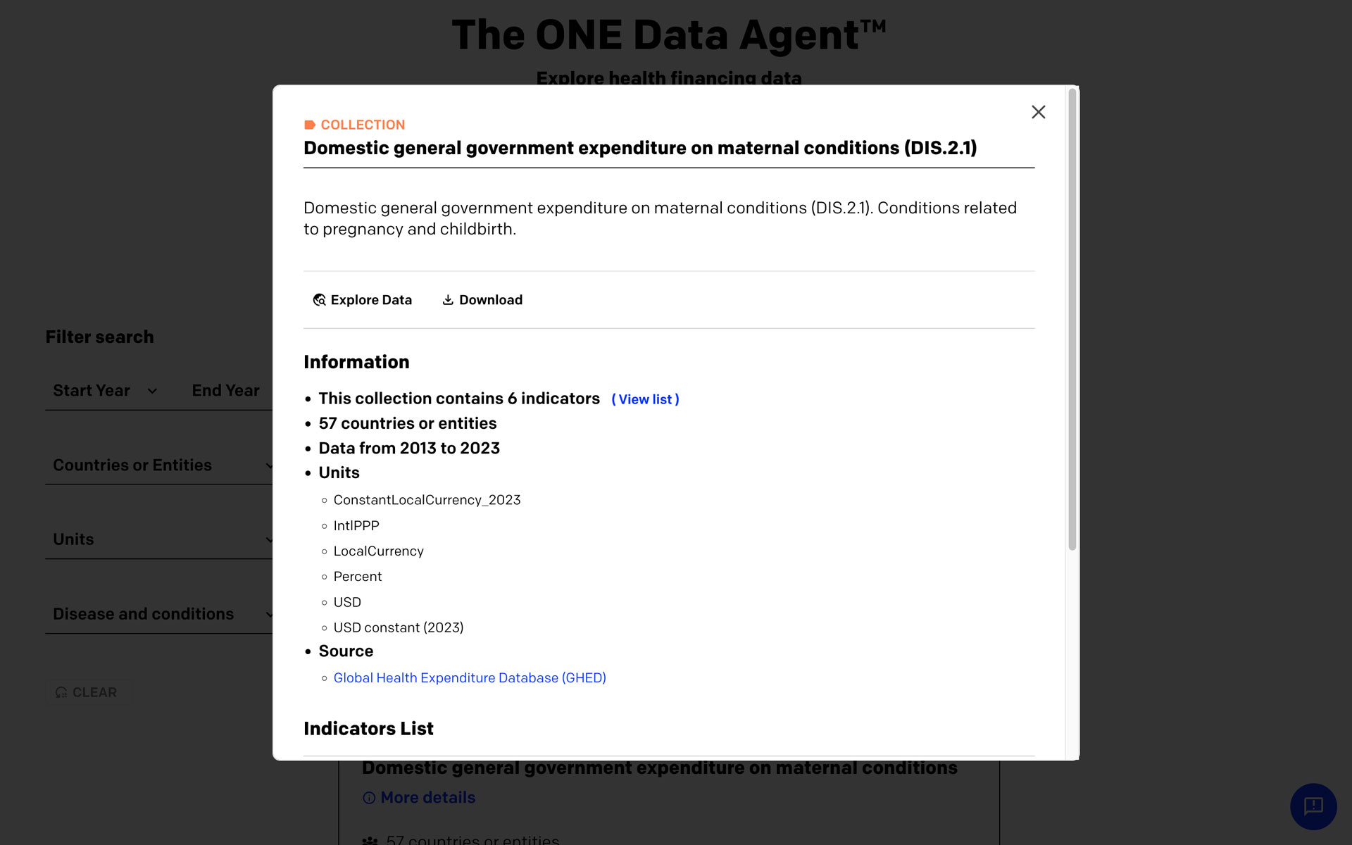
The data catalog was searchable and filterable, built around the assumption that users arrive with a question, not a dataset. Findability was a first-class concern: the interface had to support both directed queries and exploratory browsing without making either feel like a workaround.
Outcome
A tool up to 60× faster than traditional data gathering, with linked sources on every output — making it auditable by design. Deployed publicly at data.one.org/tools/agents/health-financing.
Reflection
The hardest problem wasn't technical — it was calibrating how confident the interface should feel. AI tools that feel too certain erode trust when they're wrong; too hedged and they feel useless. That tonal design question never fully resolves, and it's where I'd invest more time earlier in any project of this kind. One architectural decision also turned out to be a trust decision: keeping more data processing on the client side meant fewer failure points between the user and their answer.