Overview
Contributed across design and engineering on the platform's front-end — working closely with the Google Data Commons and Next Solutions teams to consolidate a fragmented component library, normalize the visual language across surfaces, and implement interaction patterns that made high-density data legible at scale. Work spanned UX design, component architecture, and ongoing refinement of an inherited codebase with significant technical debt.
- Website: www.datacommons.org
- Client: Google Data Commons
- Team: Next Solutions, Google Data Commons
- Role: Product Design, UX Engineer
- Tools: Figma, Github, ReactJS, TypeScript, CSS, Material UI
- Year: 2024 – 2026
Context
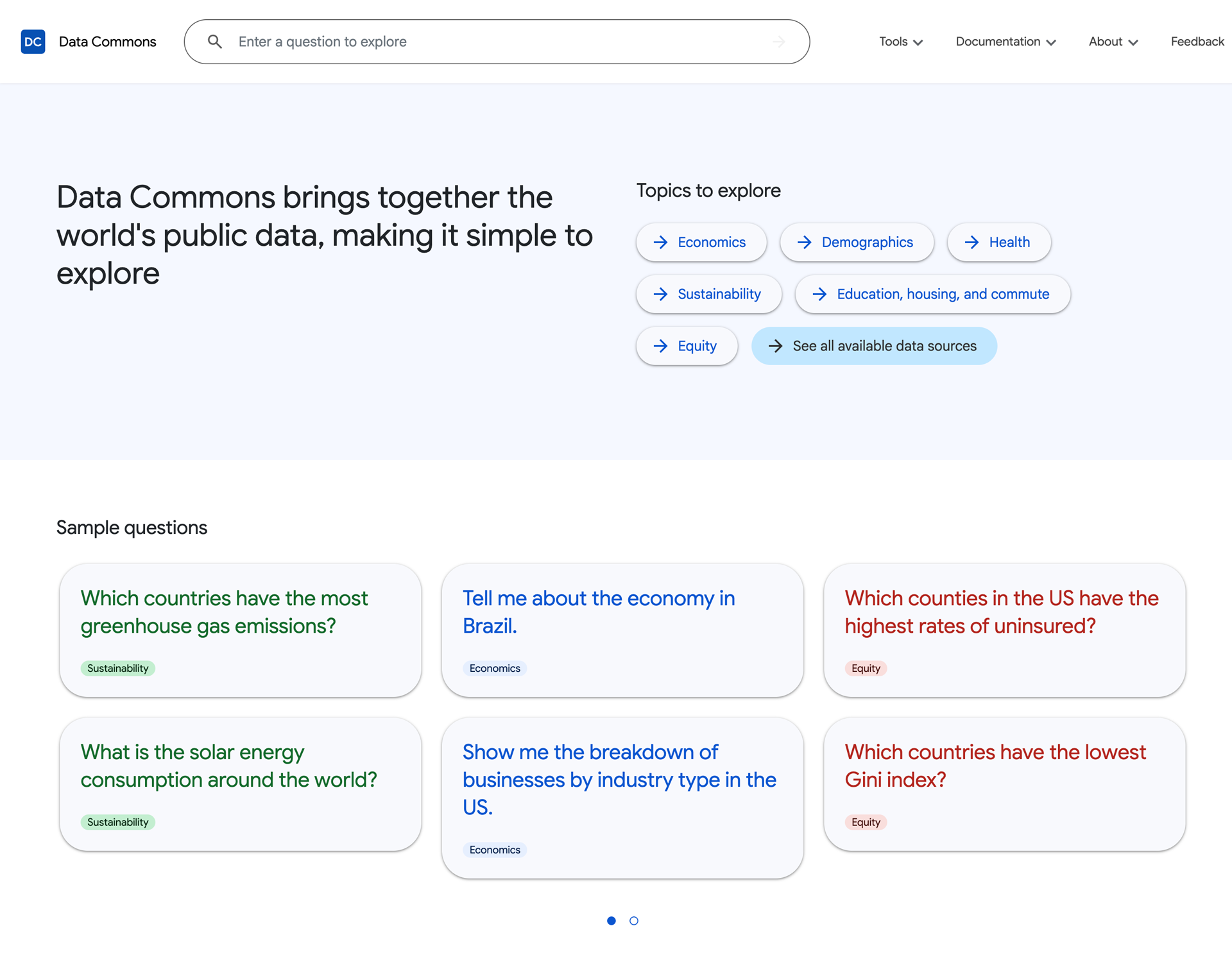
Data Commons unifies thousands of public datasets into a single platform used by researchers, journalists, and policymakers. The platform had grown across multiple tools and surfaces — each built at different times, by different teams — leaving behind a layer of inconsistent components, divergent visual patterns, and legacy code that made every new addition harder than it needed to be.
Problem
The challenge wasn't a missing feature — it was accumulated technical debt embedded in the UI itself. Spacing was ad hoc, type hierarchies varied across surfaces, and many components had been built in isolation rather than as part of a shared system. The result was a platform that felt incoherent and was expensive to maintain. Consolidation had to happen without disrupting an active, production platform.
Process
The consolidation followed a deliberate outside-in sequence: structural elements first, specific components second. Headers, menus, footers, containers, and layout wrappers were addressed before anything else — not because they were the most visible, but because getting that layer consistent created stable ground to build on. Trying to fix specific components on top of inconsistent structure would have meant rework at every step.
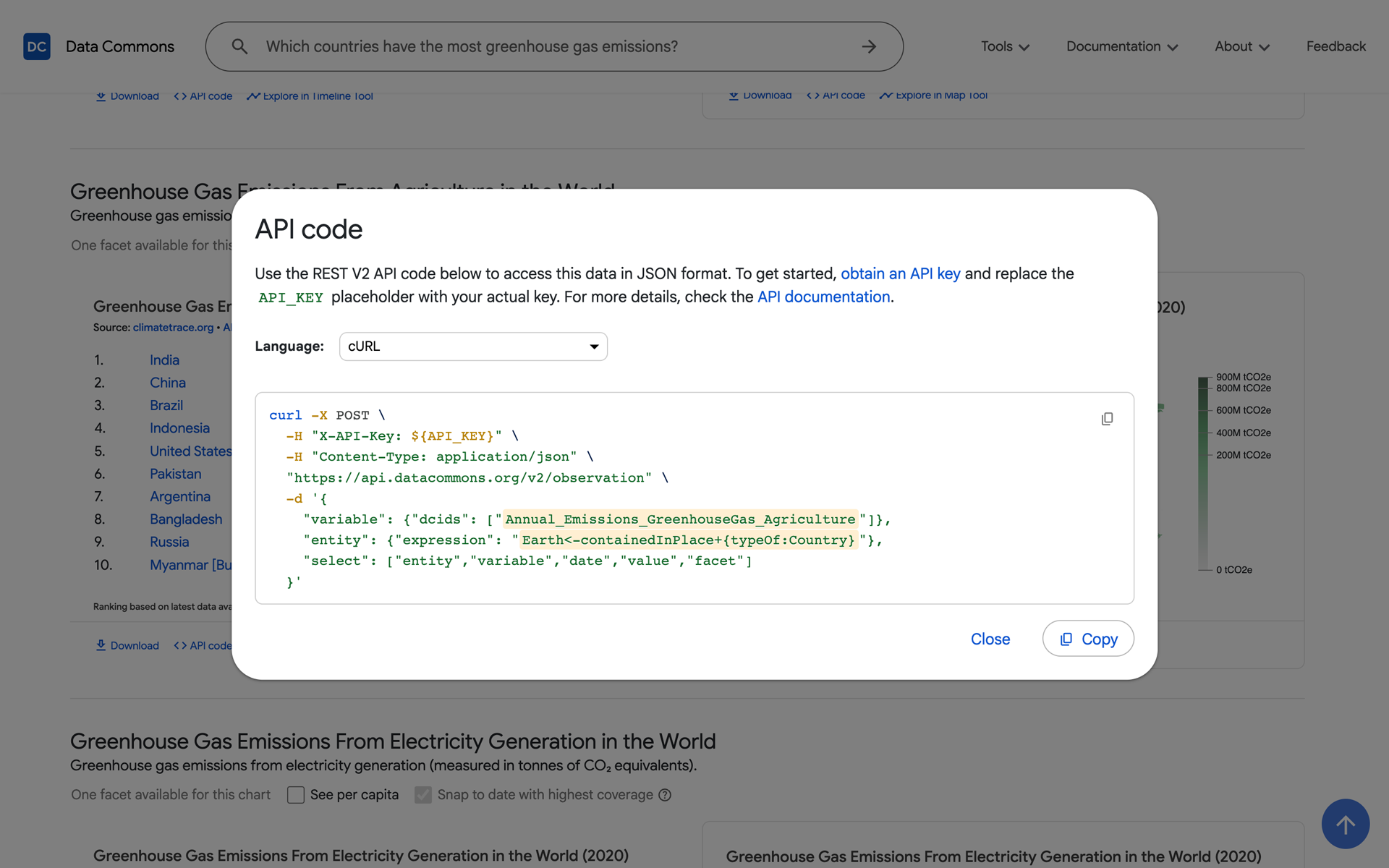
Once the structural shell was coherent, the work moved inward — refining components that handled real data: search results, statistical tables, dialogs, and filtering interfaces. Each was reviewed against the emerging system rather than treated as a standalone fix. Material UI provided the base, but was extended throughout to meet the density and readability requirements that a general-purpose UI library doesn't account for.
Design System Foundations
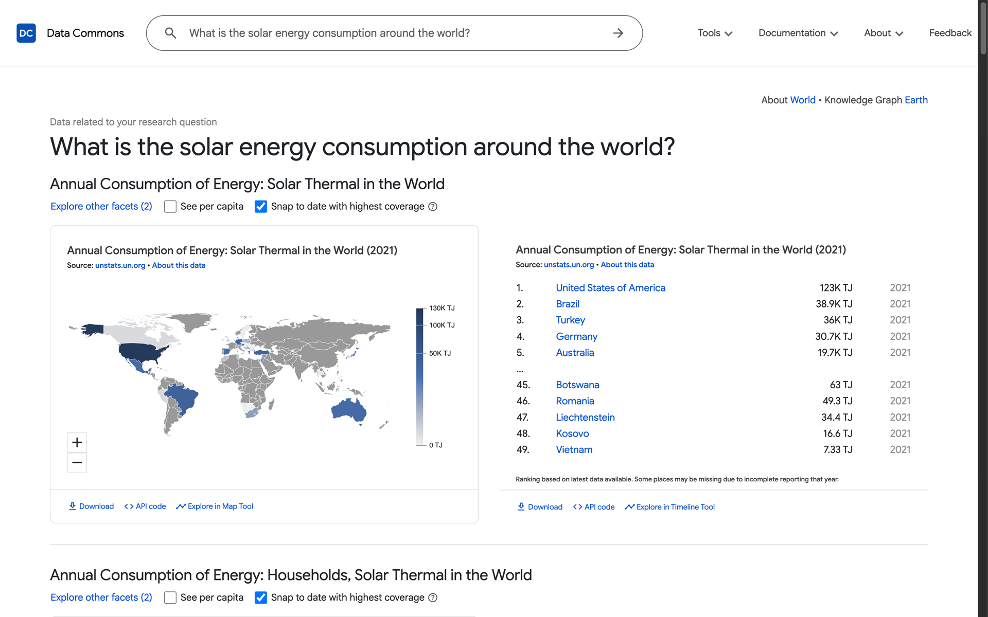
Running alongside the consolidation was the standardization of the visual language: a defined type scale, a consistent spacing system, and color assignments with clear semantic roles. On a platform where users read and cross-reference dense statistical information, these decisions carry real cognitive weight — consistent spacing makes data tables scannable, a predictable type hierarchy reduces the effort of moving between tools, and color used functionally rather than decoratively keeps the interface from competing with the data itself.
Collaboration
The work ran as a close loop between teams. Design decisions were reviewed against engineering constraints in both directions — what was being built in Figma had to be viable in code, and what engineering identified as legacy debt informed design priorities. Regular syncs kept the two teams aligned on sequencing: what to consolidate next, what to defer, and where legacy patterns could be left in place without compounding the problem.
Outcome
A platform that is more coherent, more maintainable, and easier to extend — where visual consistency reinforces rather than competes with data legibility. The outside-in approach meant that each phase of the consolidation delivered usable improvements rather than blocking progress behind a big-bang rewrite.