Overview
Led design and frontend engineering for a public-facing data dashboard commissioned by the Florida Apartment Association — translating large volumes of housing and demographic data into an interactive, accessible tool for researchers, policymakers, and the general public. Work covered the full design process: from stakeholder research and information architecture through to a custom design system, interactive maps, and a CMS-managed frontend.
- Website: buildflorida2030.com
- Client: HR&A Advisors and Florida Apartment Association
- Role: User Research, Art Direction, UI & Interaction Design, Information Architecture, Frontend Development
- Tools: Figma, Jira, Github, ReactJS, SASS
- Year: 2022
Context
Florida's rapid population growth had created a significant housing shortage, and the Florida Apartment Association needed a public-facing tool to make that case clearly — to community members, journalists, and policymakers who don't typically engage with raw datasets. The data existed; the challenge was making it legible, trustworthy, and worth exploring.
Problem
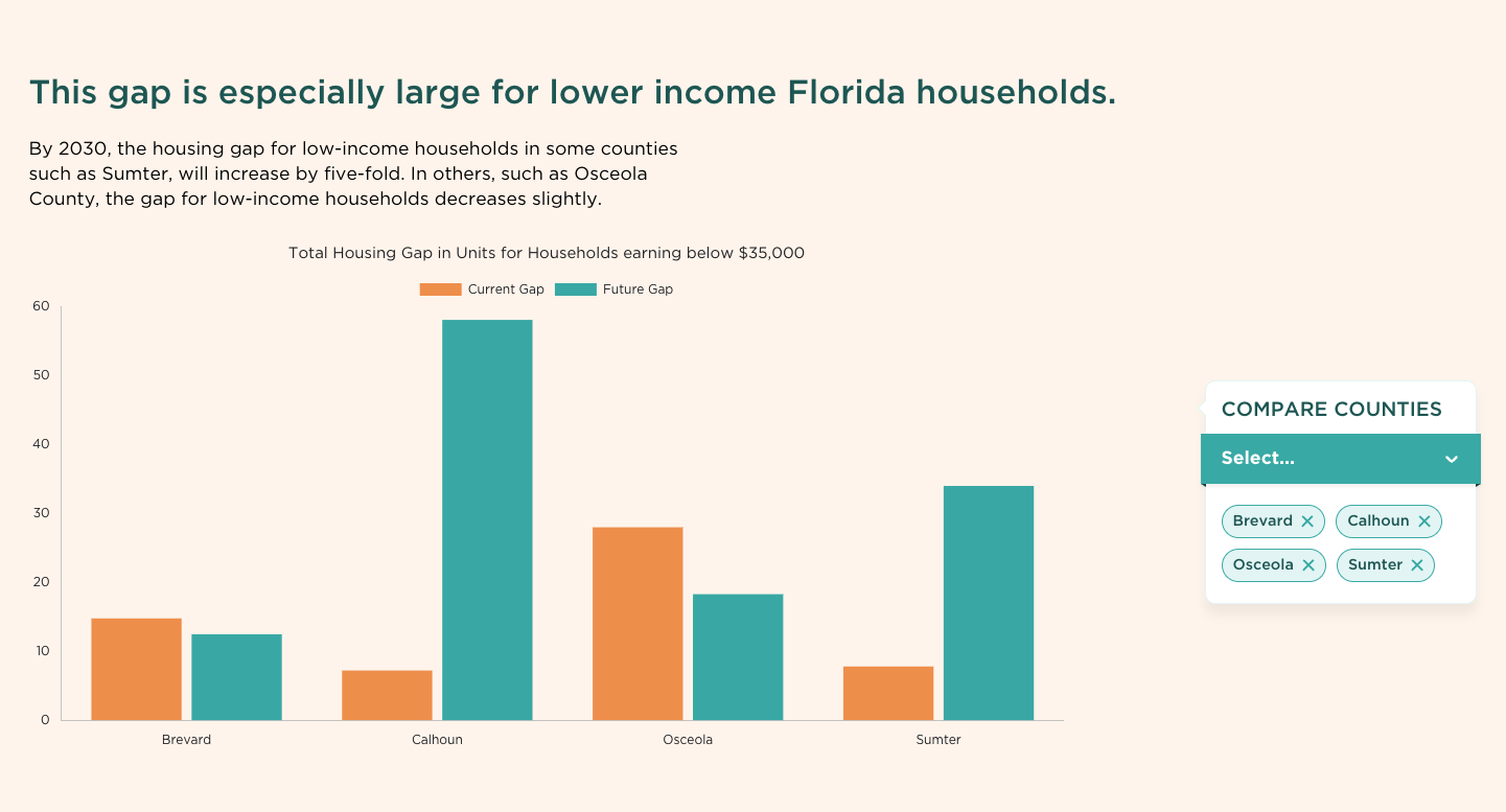
Data presented without structure or context is easy to misread or ignore. The FAA had an abundance of housing and demographic data, but no way to present it that was both honest about complexity and accessible to a non-specialist audience. The risk was a dashboard that researchers could navigate but everyone else would bounce from — or one simplified to the point of being misleading.
Process
The project started with stakeholder interviews to align on requirements and define measurable goals, followed by user research to map out three distinct personas — researchers, policymakers, and the general public. While all three shared the same core data needs, their depth requirements differed significantly. That finding shaped the primary interaction model: present the simplest useful view first, and invite users deeper on their own terms rather than front-loading complexity.
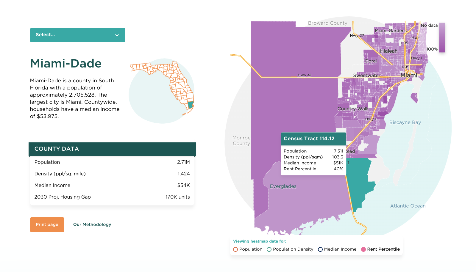
From there, the work moved into information architecture, a custom design system built from atomic elements up to components, and low-fidelity prototyping before any visual decisions were locked in. The map component went through a significant design revision during user testing — the first iteration handled one dimension of data cleanly, but real-world testing made clear it needed to support multiple overlapping dimensions. That constraint drove the final choropleth approach: county-level data with contextual overlays and census-track specifics accessible on demand.
Design System & Visual Language
A custom design system was built from scratch to serve the density and interactivity requirements of the platform. Typography, spacing, color, and component behavior were defined as a cohesive system — not assembled ad hoc. Color carried semantic weight throughout: distinguishing geographic levels, signaling data ranges, and maintaining readability against map backgrounds. The system was designed to accommodate future data additions without requiring redesign.
Collaboration
Worked closely with HR&A Advisors on the data and policy framing — ensuring that what was visualized was accurate and defensible, not just legible. Backend collaboration covered CMS integration, making it possible for the FAA team to update data and content independently after launch. Alpha and beta testing rounds with real users shaped final interaction decisions, particularly around map context and data export.
Outcome
A fully responsive platform where users can explore housing data at state, county, and metro area level — comparing indicators across geographies through interactive maps and exportable charts. All content is managed through a tailored CMS, giving the FAA team ongoing control without developer dependency. Export and print functionality made the tool directly useful for journalists and policy advocates preparing their own materials.
Reflection
The hardest call was on the map. The initial vision was deliberately minimal — and it worked aesthetically — but testing with real data showed it lacked the geographic references users needed to orient themselves. The solution was two versions: a clean overview and a context-rich detail view. That tension between minimalism and legibility doesn't fully resolve; it gets managed. The other lesson came earlier: before any visual design was possible, the data itself had to be cleaned, organized, and understood. The story only became clear once the data did.